 Transparent background
Our brand. Ready to use.
Official logos for your story, integration or presentation. Choose a version and download it directly.
The essentials.
SVG for any size. PNG for slides and social. Logos and symbols are transparent; icons are square on a solid background, ready to upload.
Transparent background
 Transparent background
 Transparent background
 Transparent background
 Solid square background
 Solid square background
A few simple rules.
Keep the identity intact. Let the work around it be yours.
Use the original artwork
Keep the proportions and colors. Do not redraw, retype, rotate or add effects to the logo.
Give it room
Leave at least half the height of the capital S around the wordmark. Keep it at least 96px wide on screen or 25mm in print.
Choose clear contrast
Use black on light backgrounds and white on dark backgrounds. The previews are backgrounds only; every wordmark and symbol download is transparent.
Upload the icon as it is
Where a platform asks for a square image, like a profile picture or an app listing, use the icon. It carries its own background and keeps the symbol clear of round crops, so let the platform round the corners.
Keep it monochrome
White #FFFFFF Ink #0A0A0A Gray #525252
Our typeface is ABC Diatype. It is licensed and not included. Use a system sans-serif for supporting text; never retype the logo.
Voice, given form.
Speech is timing, texture and character. Our visual language gives those qualities a form you can recognize.

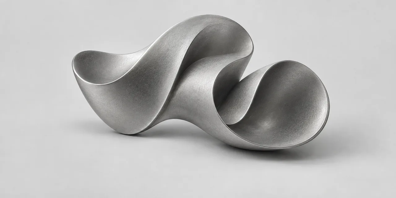
A shape for each model
Our Simba sculptures give an invisible technology a recognizable form. A crest for expression. Rounded folds for language. Shared satin silver, different silhouettes. Conceptual artwork, not measured sound or physical hardware.
Movement with a purpose
The brand wave moves slowly, then responds to the energy of prepared speech. Motion rests when it is out of view and can always be paused. Listening never depends on animation.
Light, not decoration
White, ink and gray keep attention on the work. In the homepage hero, a restrained violet and warm-light field adds depth around the wave. The logo, typography and controls stay monochrome.
Sculptures are model identities, not alternate logos. For approved artwork and campaign formats, ask our team.
The numbers, with their dates.
Writing a comparison or a listing? Copy from here rather than from a page that quoted us last quarter.
- Every figure here carries the date or scope it was measured on. Quote them together, or quote neither.
- We do not claim a leaderboard position. Boards move daily and a placement quoted six months later is simply wrong.
- Latency is our own production median. The independent benchmarks are evidence beside it, never its source.
- Re-check anything older than a month. This page is generated from the values the product ships with.
- What it is
- Text-to-speech and voice cloning API
- The developer platform at speechify.ai. The consumer reading app is a separate product at speechify.com. SpeechifyAI is Speechify's developer API, billed separately from the Speechify Reader app. A Reader subscription does not include API usage.
- Time to first byte
- 56 ms p50, 102 ms p90
- Our own measurement: first byte on our production US East streaming path, read 15 Sep 2026. The p50 is a median; neither percentile is a guarantee, a cross-vendor benchmark, or time to audible speech.
- How we measure it
- Independent first audio, Coval
- 109 ms median, Simba 3.2
- Coval's own measurement over the 24 hours to 9 Oct 2026 11:00 UTC, from its runner to the first audible sample, so it includes the network and any leading silence. Evidence beside our first byte, never its source. Re-read by 24 Oct 2026.
- SpeechifyAI's reviewed snapshot of Coval's board
- Independent first audio, Voice Arena
- 123 ms p50, Simba 3.2 Real-time
- Voice Arena's own reading on its US English board, 16 Oct 2026, from its runner to the first audible sample. Evidence beside our first byte, never its source. Re-read by 24 Oct 2026.
- SpeechifyAI's reviewed snapshot of Voice Arena's board
- Independent listening quality
- Simba 3.2 at Elo 1,244 ±13, Artificial Analysis, all provider voices (no accent filter)
- Reviewed snapshot taken 13 Oct 2026, published with its confidence intervals. Intervals overlap other models on the board, so it establishes no guaranteed quality advantage, and we claim no placement.
- SpeechifyAI's reviewed snapshot, not an official Artificial Analysis export
- Price
- from $6 per 1M characters
- The Scale rate. The metered ladder is $10, $8, then $6 by tier. Billed per character against one monthly allowance, with no seat licence in any plan.
- Plans and rates
- Free tier
- 500K characters a month
- $0 a month, and commercial use is included on every plan. Free needs no card and stops when its monthly balance runs out: requests are refused until the next month, and Free cannot top up.
- Plans and rates
- Billing
- Monthly, no annual commitment
- Starter, Pro and Scale are monthly plans with no annual commitment. Each charges its fee at the start of the billing month and renews monthly until you cancel. Cancel or downgrade anytime from Billing in the console. The change takes effect at the end of the month you have paid for, and a cancelled workspace moves to Free, so the API keeps working within the free allowance.
- Billing questions
- Top-ups
- Prepaid, no expiry
- On paid plans. A top-up is paid up front and does not expire. Auto top-up stays off until you turn it on. The monthly plan balance, by contrast, expires at the end of each billing month.
- Billing questions
- Voices
- 900+ shared voices
- Filter GET /v1/voices by each voice's models[]; a voice is not available on every model.
- Voices reference
- Languages
- 6 self-serve, 48 in total
- A new signup selects 6 languages across 7 locales. The wider set runs on our multilingual model and is available on request.
- Models
- Voice cloning
- Instant, from a short sample
- Zero-shot, self-serve from the Starter plan upward, with a consent workflow in the API. Not a studio process with a waiting period.
- Voice cloning
- Audio and controls
- 24kHz, 20,000 spoken characters per stream
- SSML pauses, speaking rate and pronunciation aliases, and word-level speech marks, over plain HTTP with chunked streaming or server-sent events. A WebSocket also takes text as it arrives, such as an LLM's reply, and streams back audio with word-level speech marks.
- Quickstart
- Compliance
- SOC 2 Type II
- Ask us for the current report rather than quoting a scope from this page; an attestation has a period and ours is not published here.
- Trust
Writing about us?
SpeechifyAI develops speech models and APIs for text to speech and voice cloning.
Write SpeechifyAI, one word. Simba is our model family. The developer brand lives at speechify.ai; the consumer reading app lives at speechify.com.
Press and brand questions
For co-branding, media requests or a format you do not see here.
partnerships@speechify.aiThese assets are for covering or integrating with SpeechifyAI. Their use does not imply endorsement, sponsorship or affiliation. Do not use the marks in your own product name, logo or domain.